


Micro-interactions or Macro-distractors
How you can make or break UX with micro-interactions.

Using motion to get users’ attention is a psych 101. We are hard-coded to react to any movement, and when paired well with a conducive intent, the interaction achieves its purposes. However, it becomes pretty evident when an interaction is forced into a design or when you commit too much to the animative aspect of the brand. As product designers, our first and foremost job is to curate experiences that serve business goals and user needs. Micro-interactions are but a subtle tool that we must use proficiently and carefully. In this article I’ll deep dive into what makes a micro-interaction delightful and how, if unbalanced, it can cause macro-distractions.
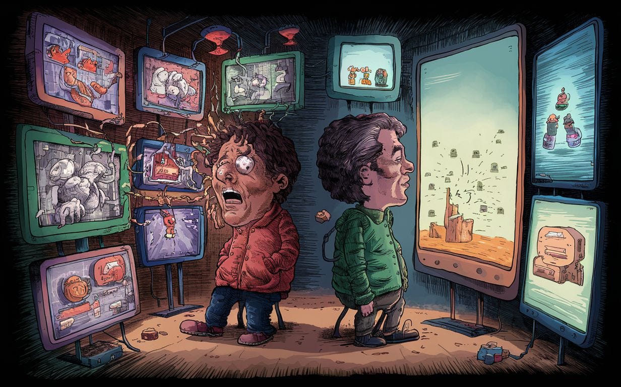
Prompt: A vividly detailed cartoon depicting two people in a digital world, surrounded by various screens displaying motion and micro-interactions. The first person is overwhelmed with complex visuals, causing confusion and discomfort. The second person is calmly observing the peaceful screen, which features simple designs and minimal micro-interactions. The overall atmosphere of the image is a blend of technology and emotion, with a touch of humor and contrasting feelings.
Why do they work
Micro-interactions solely exist to delight user experiences. To reward the user with an engaging animation for their actions. They stir up bland and boring experiences into something worthwhile, achieving user retention. They work best when they are short, sweet, and intentional. It is important that this pocket of opportunity is not treated as a stage to showcase animation skills. It must serve a function apart from validating or visualizing a trigger response. Its success is directly correlated to the Aesthetic-Usability effect, meaning that users often perceive aesthetically pleasing design as more usable. They’re also a very nice way of conditioning users to a certain behavior i.e. an enjoyable micro-interaction that entertains the users while the site loads is an astute example of how it retains the users despite the delay in success.
When do they not work
The rule of thumb I use to balance a design is “If everything is visually salient, nothing is”. Micro-interactions are going to be one aspect of visual design and animation you incorporate on your page. If there’s already a lot going on there, the experience will inadvertently become overwhelming and confuse the users in carrying out simple tasks. Also, if the micro-interactions are not thought through, they can very easily puzzle the users and cause discomfort- leaving them in the arms of an interactive art that does them no good. Pay attention to the details and incorporate them in a way that it complements the UI on the page and UX of the flow.
Consistency is the key
Here’s where branding and consistency meet. The visual design of your digital product and the branding of its ecosystem must be in harmony. If the micro-interactions are not an extension of the static UI then it might break the immersion of experience. Avoid re-inventing the wheel every time by sticking to a theme. Build a design language that can be scaled according to your use and pass the baton from static structures to dynamic micro-interactions seamlessly. Define the rules and stick to them.
Blending micro-interactions into your UX
The eventual goal is to make design invisible. The users must be able to carry out the actions of their choice intuitively before they can even say err. Understanding the root of your problems and incorporating the right micro-interactions can subtly offer quick validation to the users. Construct them using previously acquired or understood knowledge and see how simpler it becomes for your users to comprehend and move forward without any hesitation.