


A Product Designer's Analysis of Humane's AI Pin (Part 2)

Apple disrupted the reign of Blackberry and Nokia’s keypad interactions and now 2 ex-Apple employees are trying to disrupt the smartphone ecosystem with this AI pin. Will they be as successful as their predecessor? Time will tell. But for us, the vast majority of customers and some designers, it brings in a new wave of options and innovations that aim to enrich our lives with great experiences. In this 2nd part, I’m exploring various design and interaction decisions Humane has taken for their AI pin and how we, as product designers, should read these signs and get ahead of the curve.
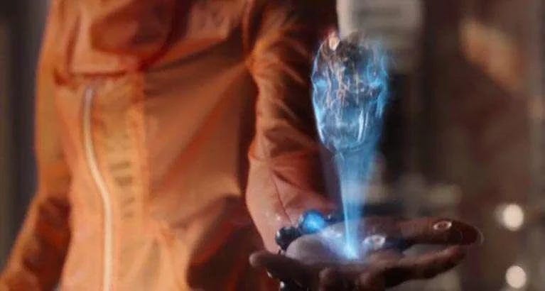
Laser Ink Display
I have to admit that it looks very cool. They could have used a better name for this tech but eh, it’s a clear pattern that they’re not great at naming stuff (the three colors AI pin comes in are not even named around colors). The inspiration is definitely from all the sci-fi Marvel movies we’ve seen and while, in comparison, it is far from achieving that level of flexibility and sharpness, it definitely positions itself in the right direction.
Still from Marvel’s Infinity War
The thing that I’ve found confusing is the color of the “Laser ink display”. In the official product explainer video, it very starkly looks like neon blue. But in other videos. I’ve found it to be closer to green. This is definitely a construct of the camera being used to film it but in a lot of Sam Cheffer’s walkthroughs, the neon blue color was practically unreadable in bright daylight.
I asked Claude
Incorporating a stark green could be a better option until the intensity of the laser can be improved exponentially. The neon blue would still work fine in a lot of setting but for this device to have an on-the-go experience, it needs to be extremely powerful and usable in public.
Gestures and Interactions
This is where things get a little tricky. Removing a screen in a world that runs on a screen can be an uphill battle. It is fascinating how Humane has started building conventions that try to mimic the real world but some require a learning curve. Let’s decode some interactions
1. Adding password
In one of the walkthroughs, Sam showcases how by adjusting the distance between the palm and the pin you can select the number and enter your password. Initial thought: Great innovation, it nicely skirts around the constraints and achieves the goal but is it calibrated to avoid error and ensure great usability? I’m not sure.
In a scenario where walking out in public and want to send someone a text quickly, would it be simple to add your password on the go? With the added privacy breach of adding the password out in the open?
2. Changing volumes
There’s no dedicated walkthrough for that but Sam very subtly gestures a scroll like interaction on the surface of the pin to dial up the volume. I think that’s a good interaction as it very seamlessly replicates the dial-up motion from the real world
3. Tilting and Clicking
The use of proximity and plane sensors is extremely innovative and does seem to work pretty well on the demo reels but the calibration and accuracy need to be perfect or adjustable like we do on our computers or I can foresee a great deal of annoyance caused by this.
The answers lie in research
Extensive usability testing for this product is crucial because all of this innovation cannot come at the expense of users breaking their existing heuristics. Designs and interactions have to be intuitive, period. Otherwise, this would fall into the same pit most VR experiences find themselves in. Great in theory, annoying in practice. As product designers, we must arm ourselves with the knowledge and experience of intense comprehension and summative tests so that all these innovations can be assigned a metric that informs our decision.
Enter Zero UI
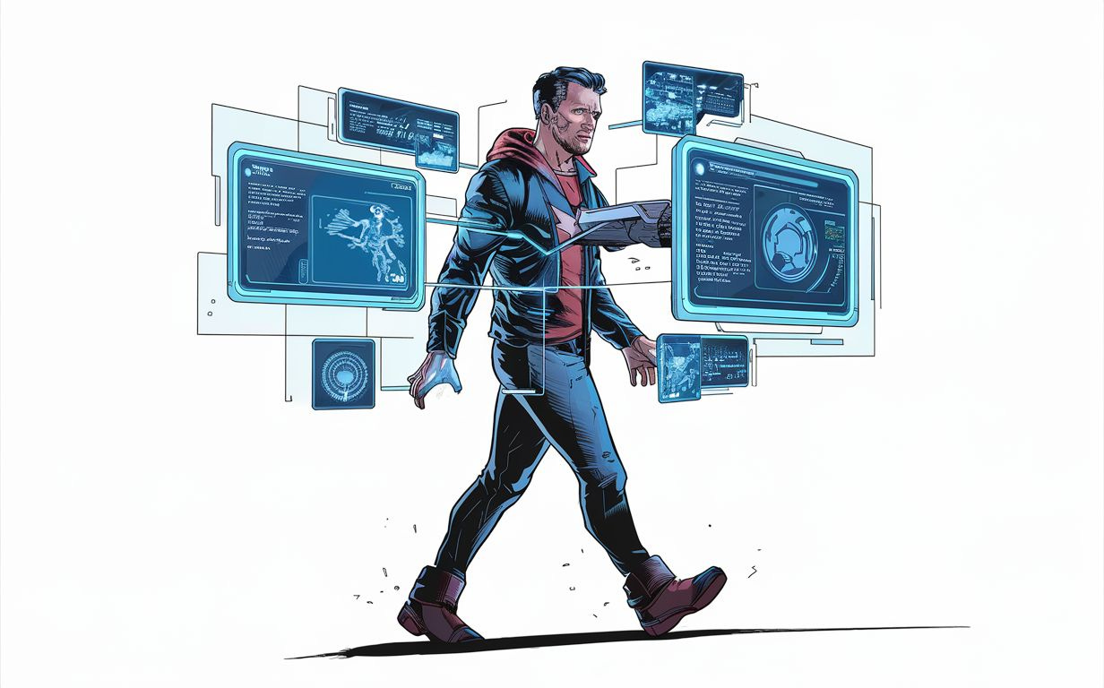
Prompt: A futuristic comic-style illustration of a man, resembling Tony Stark, walking around with an advanced high-tech interface floating around him. The interface consists of holographic screens and digital information, providing him with all the necessary data to accomplish his tasks. The overall aesthetic is sleek, modern, and reminiscent of cutting-edge technology from the comic book universe.
If smartphones were to become obsolete, something I believe in, Zero UI is going to be the future of interface design. As a product designer, having experience or PoCs in concepts like this is a sure-shot way of standing out from the crowd. While this topic requires an article of its own, I’d implore my readers to start researching and building projects centered around zero UI.
In the next part of this breakdown, I intend to dive into the accessibility issues this product poses.